Analyzing UX & UI decisions in classic racing games | by SYH | Apr, 2024
[ad_1]
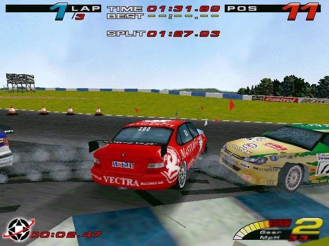
I think this was the case, as there was a technological arms race going on with the console manufacturers, those being Sony, Sega, and Nintendo, all with their own technological agendas. Whose machine was the most powerful? What could it do that the others could not? They then put the developers to task to impress and dazzle. It was all about how many pixels and polygons your machine could push, almost like a car enthusiast squeezing every drop of performance out of a clapped-out banger. Developers were metaphorically slapping “go faster stripes” and gaudy sports kits all over the lovingly engineered games.
As you can see, the style of UI for a lot of these games is so overly worked that it borders on parody; a bit if you were to see a character in a Hollywood movie or TV show “playing a game” and the special effect guys put these shots together. You can see there is a real lack of finesse and cohesion, too many typefaces, and chunky UI widgets that stylistically do not match each other even within the same screen space. These issues could all be solved with more emphasis on solid graphic design rather than dazzlement. User interface graphics can still be perfunctory and at the same time be aesthetically impressive. But this heavy-handed style developers were using was overnight out of fashion when Sony (who just were relatively new to game development) dropped the super stylish future racer Wipeout.
Wipeout is a key title in gaming art history, as it redefined how to approach the art direction of a title completely. Sony hired the renowned creative design house, Designers Republic, to create the box art, typography, team logos, and, of course, marketing materials. At the time, the Designers Republic was mostly known for its design contributions within the music and fashion industries, including the record label Warp (which even supplied music for the game). The studio created logos and artwork for the likes of the most cutting-edge musical artists at the time, such as Aphex Twin. This exterior viewpoint into gaming gave Wipeout and the PlayStation itself a sense of style and finesse not seen before in gaming. It really made other developers stop and think about the whole package of a title; every element requires an adequate amount of attention to make the experience sing.
The only problem with Wipeout was this new cool style was mostly happening with on marketing and box art, not as much as the in-game UI work (apart from typeface logos, icons, etc). Perhaps lacking the full treatment in and out of the game Wipeout was never less of a start in a revolution in UI aesthetics that developers worldwide took note of. Shortly after this release Sony created another driving title that helped pave the way for Ridge Racer type 4’s creative mark, Polyphony Studios Gran Turismo.
This was the first serious driving game on a home console, and it brought an earnest vibe to the experience. It used a neat and concise UI style that was mostly functionally driven, but you could see style liberally dotted throughout. Nice graphic design makes sure to use most of the screen space with the header/footer layout. You can see from the shots that there is a seed of inspiration that sets the tone of the Ridge Racer type 4 black/yellow color palette, although it is inverted. Gran Turismo, once more, was a positive development for game UI design; yet, as we’ve already mentioned, it was mostly function-driven, therefore it lacked ambiance and ultimately was not, was not as memorable. This brings us to the primary topic of this essay, Ridge Racer Type 4, but before we go too far ahead of ourselves, let’s take partake in a brief analysis of a few earlier series titles for reference sake.
Ridge Racer (1993) PS1
A popular game for the PlayStation 1 and a key selling factor for the system itself was Ridge Racer. In the 1990s, the ability to replicate the true arcade experience at home was a major selling feature of the PlayStation because, before the introduction of the Sonys powerhouse of a machine this was hard to do on the older consoles such as the SNES and to make a game in 3D? Impossible.
Rage Racer (1996) Playstation 1
Rage Racer was the first PlayStation-exclusive game in the series, and with its arrival, the developers needed to. It was difficult to figure out how a Ridge Racer game would feel outside of the arcade setting as Ridge Racer transitioned to a console-only experience. Rage Racer was an oddly somber departure from earlier games; it had a grungier and darker vibe. The user interface makes it clear that the series was in a bit of an aesthetic identity crisis, with vehicle schematics and graphs underlying a range of odd typography with a rock music aesthetic that was not quite gelling together. The game itself was great, but in its presentation, you could see an aesthetic mismatch from a game trying to be bold and eye-catching but no longer necessarily needed to draw attention to itself.
[ad_2]
Source link


