

Mobile search: which pattern should you choose? | by Ksenia Toloknova | Feb, 2024
[ad_1]
The choice of the entry point and its location depends on the level of emphasis required in the search.
In the article by Suzanne Scacca for Smashing Magazine (2019), various entry point options are well outlined. Suzanne notes that the search can be positioned at the top and bottom of the screen. We want to add that as of 2024, the search bar may not only appear at the top or bottom. It can also be located within the screen.
Let’s consider three the most common options.
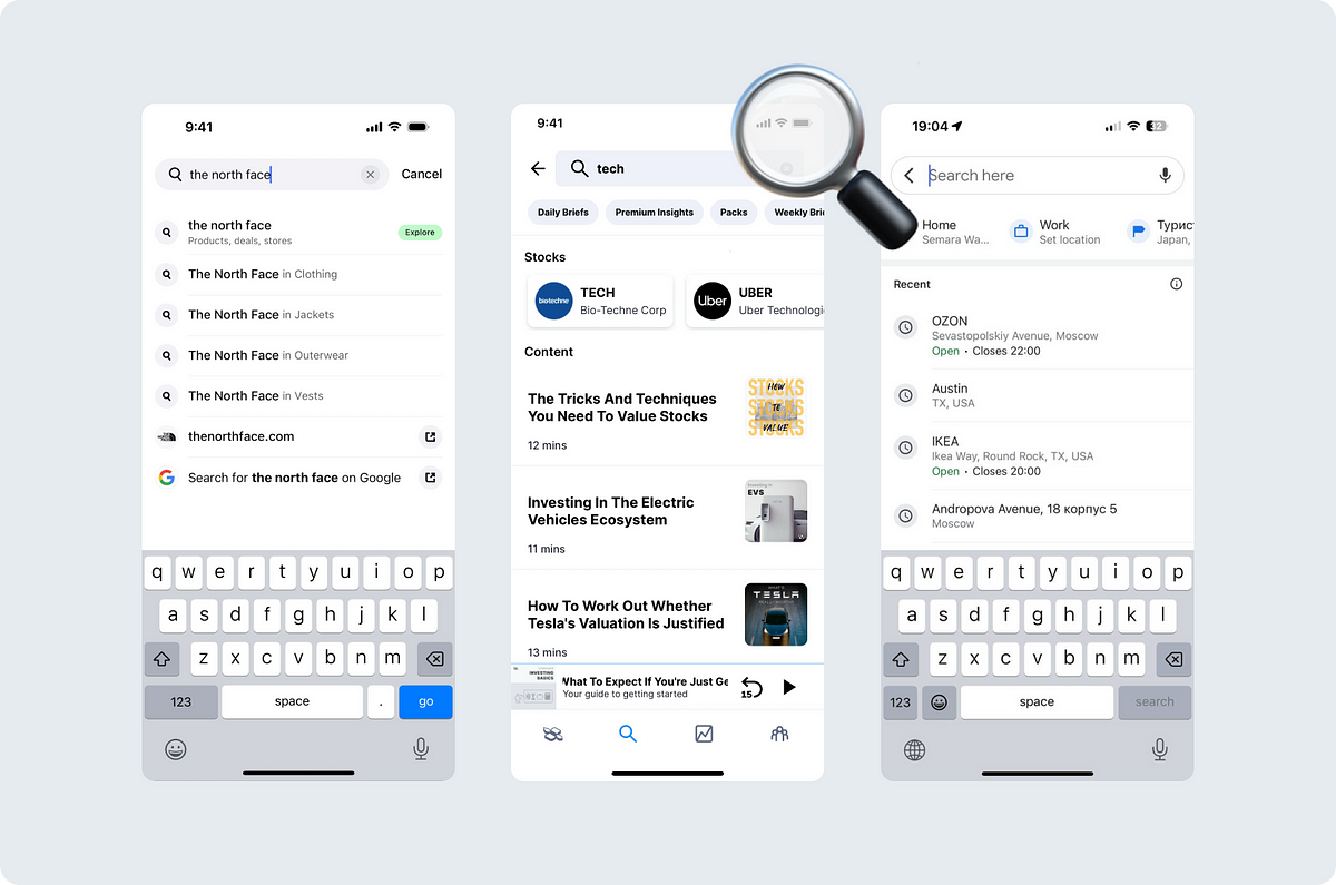
Search bar
This option is preferable when the main focus has to be on the search functionality. The search bar occupies significant space on the screen, making it more accessible to users. This is especially convenient in situations where the search is a key function or the primary way of interacting with content. Examples of such a bar can be found in apps like Google Maps, Airbnb, DoorDash, and many others.

Icon in bottom navigation
Placing the search icon in the Tab bar (Human Interface) or Navigation bar (Material guidelines) provides access to the search function from any screen of the application. This option is suitable for applications where the search plays an important role in overall navigation, and users can quickly switch to the search regardless of the context. This approach makes the search function more easy to access. You may encounter it in apps like Instagram, Uber Eats, Apple TV.
It’s worth mentioning that the search field and the search icon in the bottom navigation can coexist on the same screen simultaneously.

Icon in top navigation
Using the search icon in the navigation bar is suitable when the search function is less prioritized or used less frequently. This option helps saving space on the screen and usually implies that users will first focus on the other aspects of the application before starting the search. In the aforementioned article, Suzanne recommends using this type of search if search is not the only important action in the application. Examples of apps where you can find such an icon quite often include Youtube, Youtube Music, Twitch.

The entry point for search can also be hidden. For example, it can be located in a dropdown menu. This option is suitable if the search is needed very rarely in your scenario.
The choice of entry point for the search should be justified based on the user’s needs and the characteristics of the application itself to ensure maximum usability and alignment with the overall navigation and design strategy of the application.
The search can be global or local. Both types of search have their advantages and are equal in demand.
Global search
Global search is necessary for applications with a large amount of content and serves as one of the navigation methods. It is not limited to any one type of content unless the application itself limits it.
An example of a global search can be found in the Google Maps app, where the search is the primary means of navigation. You can find everything you need through the search field — the nearest gas station, cafe, restaurant, or landmark.
Useful tip from developers: “Despite appearing as a separate screen, this search is implemented into a modal window. This can be visually understood by observing the screen’s appearance — it lacks the standard animation of appearing from the side.”
Useful tip from developers: “Implementing voice search is not difficult if it works simply as a word recognizer. The language in which recognition occurs depends on the phone’s system settings.”

Global search is often available directly from the main screen of the application. In addition to Google Maps, such a feature can be found in Booking, Airbnb, Zillow, and many others.
Incorporate global search into your application if users may need to find something undefined or not entirely specific.
Local search
Local search makes it easier for users to discover relevant information within a specific context or area of the application.
An example of local search can be found in the Facebook app under the Friends section. Here, the entry point for search is indicated by a magnifying glass icon. By clicking this icon, a user opens the search by the list of people. This search is limited to the list of people, in other words — it’s local.

There aren’t any rules about which type of search is better. Both options are in demand depending on the user’s needs and application features.
There are two main options of what happens after clicking on an input field or a search icon.
New screen
Most often, the search opens on a separate screen that focuses the user on their search request. It’s worth noting that this screen can be either a full-fledged screen or a modal one. Visually, they will primarily differ by the exit point from the search scenario:
Back arrow icon, clicking on which allows the user to exit the search mode. This is usually used to denote a full-screen display, but sometimes such an arrow can also be placed in a modal view.
Х icon on the right or left. We’ll mention right away that this solution has a downside. We’ll discuss it below.
Swiper or downward arrow (sheet). Depending on the platform, the appearance of the curtain usually differs. In iOS, it typically appears as a full-screen sheet with a swiper and a darkened top, while in Android, it features a downward arrow in accordance with old Material guidelines (At the time of February 5, 2014, this is no longer in the guidelines).

Same screen
If the search opens on the same screen, it’s likely intended for searching within the content of that screen and operates as a filter. An example of such a filter-search is found in the Telegram app. Activating the search within a channel can be done from the dropdown menu. Upon clicking the search, a search bar appears in the Navbar, filtering the content.

Suzanne Scacca: “Think about stores that have loads of comments attached to each product. If your users want to zero in on what other consumers had to say about a product (for example, if a camping tent is waterproof), the search function would help them quickly get to reviews containing specific keywords.”
The choice between a separate new screen and an on-screen search depends on the context of use. A separate screen may offer a more focused space for searching, while an on-screen search can be convenient for quickly filtering content without navigating to another page.
Simple display
Simple display is suitable for situations where the content is relatively uniform and does not require additional classification. It provides a linear display of results, which simplifies the perception of the information for the user.

However, in the case of a large volume of content, a simple display may lead to difficulties in finding the necessary information due to oversaturation with the results.
Categorized and filtered display
If your application contains various types of content, consider adding categories, filters, or their combination. They provide a more structured approach to organizing results.
Categories allow users to find the desired information more quickly by focusing on their areas of interest.

Filters, in turn, help narrow down the search and present results according to specific parameters such as a date, a content type, an author, and so on. Multiple filters can be used simultaneously.
“Use filtering to cut screen clutter,” recommends Catherine Dee in her article.

Another option is a simultaneous combination of categories and filters. If you decide to use such a complex option, make sure that your audience understands the formulations, as recommended by the Nielsen Norman Group: “Vague groupings and unclear labels increase cognitive load.”

Sectioned display
A less common but interesting option is a content display with sections. This type of display is implemented in Messenger. This option is suitable if you prefer to avoid introducing additional navigation, and if the content can be divided sensibly. Such categorization can help users reduce the time spent selecting the desired option, thereby enhancing the user experience according to B.J. Fogg’s Behavior Model.

Simple search
A simple search field is the most common and familiar way for users to search for information in an application. It is a standard text field where the user enters keywords or phrases to search for. The mechanism of operation of such a field will be discussed below. Spoiler: consider how the user will exit the search mode.
Multi-search
The multi-search allows users to process multiple search queries simultaneously. An example of such an approach can be found in the Zillow app, which allows users to search for real estate in multiple neighborhoods simultaneously. After selecting a neighborhood, it is automatically added to the search field as a tag. If necessary, the user can add another tag, by adding another neighborhood.

In addition to this, you can refine requests by clicking on the filtering icon.

Another interesting implementation of multi-search functionality is done by Google. They have integrated search by both photo and text.

Implementing the multi-search requires additional functionality that allows users to manage multiple search queries simultaneously. This includes adding and removing tags, managing their order, and combining queries for more precise results. If you are designing such a complex search, it is important to consider all clickable areas, as there are many of them here. Here’s an interesting article on this topic.
[ad_2]
Source link

")