

Making of true multi-brand design system | by Pavel Kiselev | Feb, 2024
[ad_1]
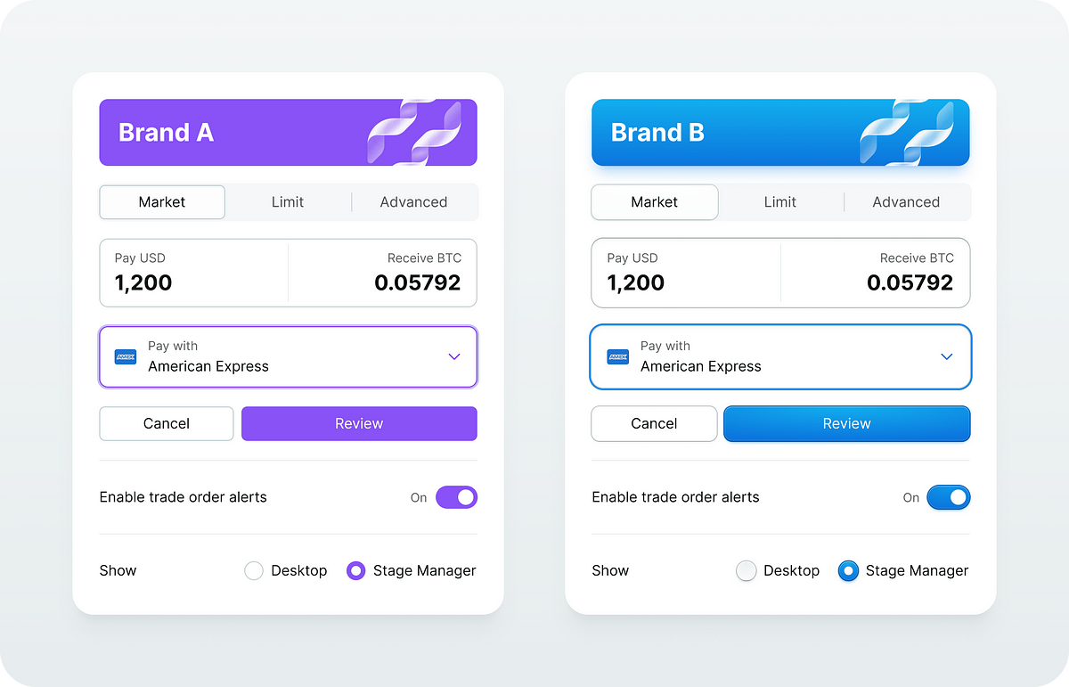
As a designer, I wanted to have a flexible and easy-to-maintain style system that I could adapt for any client on any platform with a plug-and-play workflow. CSS-like classes if you will.
The concept
To make it work I need to decouple components and their styles. It’s like creating CSS classes for buttons, dropdowns and forms but using Figma components. I call them style components.
The style component represents a reusable UI element style and it is very similar to the CSS class.

In Figma, the style component instance is absolutely positioned and it sits behind the content.
This way I can reuse this visual layer over and over again to style similar components in a consistent way.

There is another interesting side effect. Because it is a component instance I can easily swap it with another instance which opens the opportunity to provide multiple style options for my components.
For example, the search box is a regular input that uses a different style.

My absolute must-have would be the following:
- Common UI element
A base style for all interactive UI elements that are clickable, hoverable and selectable. Things like menu items, list items and nav items. - Buttons
Default, primary, destructive and ghost buttons - Form controls
Inputs, checkboxes, radio buttons and toggle switches - Focus visual
Re-usable and consistent focus visual that I can apply to any element I like - Overlays
Styles for modals, dropdowns, toasts and pop-overs
Style component structure
It’s a good idea to keep a consistent structure for the style components. It makes it easier to maintain and replace layers whenever I need to.
After multiple experiments, here is what I ended up with.

Let’s break it down.
- The background layer is for the main colour and layer effects to apply. The background image layer inside does the same job as a background-image property in CSS.
- The drop shadow component is a custom-made elevation effect to support colour bleed shadows. This way I can change the shadow colour however I like without creating a dedicated effect style in Figma. And I can even change the shadow blending mode too!
The image below illustrates what I can get using the base style component with only a few colours.

Let’s not forget about the dark mode.

Visual States
All interactive elements must have visual states. I use component variants to implement that.
Here is for example my primary button style.

And this is the form element.

A very important feature in modern UI development is the ability to modify colours which is a great way to simplify the colour palette.
For example, in CSS we can use color-mix() function and we can overlay any solid fill with gradients. All modern CSS pre-processors have colour functions in one way or another.
The issue is that Figma does not have that for styles and colour variables. To overcome this limitation I have to rely on special design components and let the layers do the job.
[ad_2]
Source link

")